Meinberg SyncBox PTPv2 User Manual
Page 17
Advertising
Configuration: Statistics
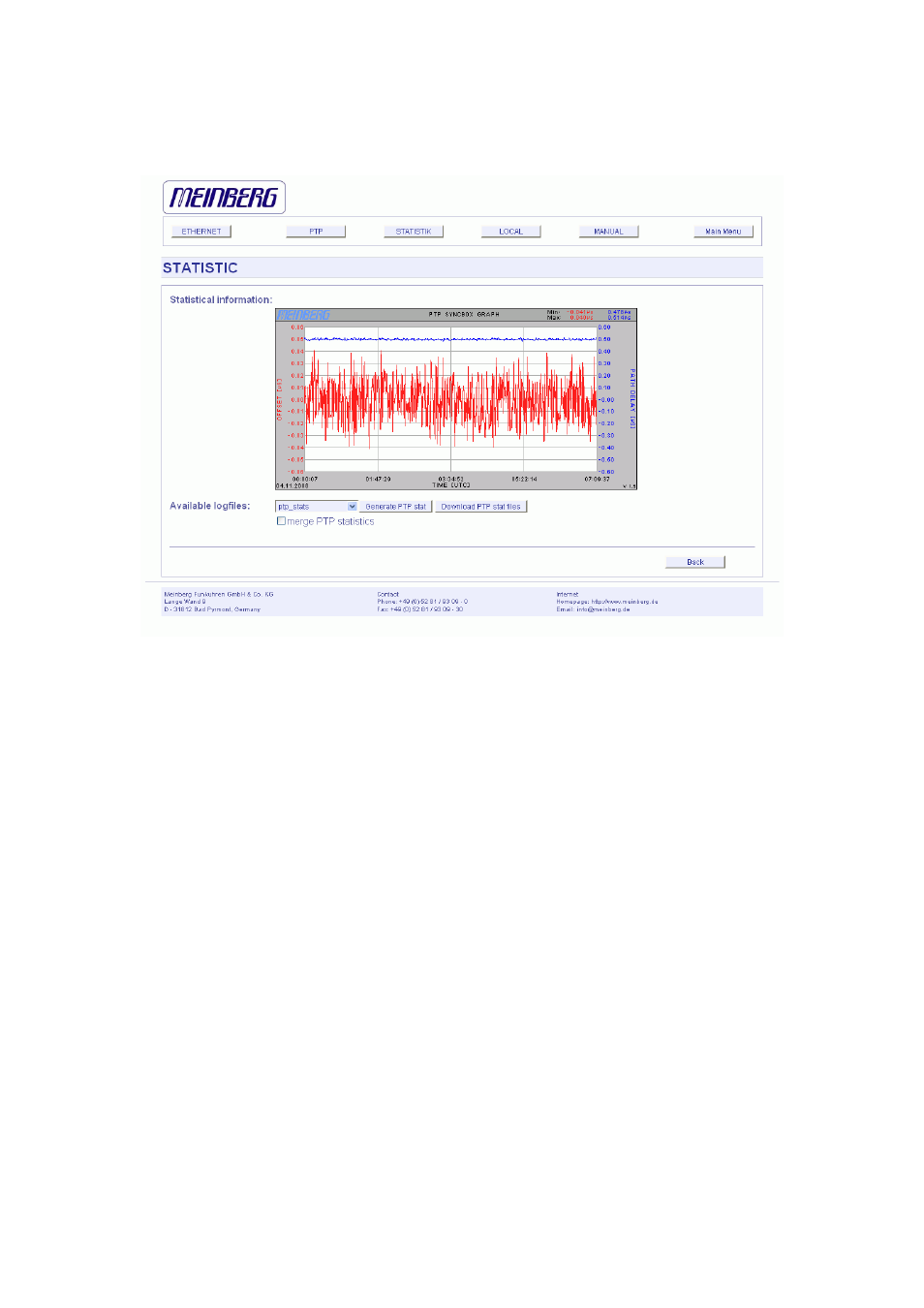
Statistical Information
In the first section a graphical diagram shows the running synchronization process.
PTP is storing this statistical information in so-called “ptpstats” files, which are used
here to draw the curves. The red line is describing the offset to the PTP grandmaster.
The blue line shows the pathdelay to the PTP grandmaster. In the upper right corner
of the diagram you will find the measurement range of the red and blue curve. The
last 24 hours are shown initially, but you are able to select the last 10 days (or fewer
days, depending on the system uptime) or download a specific ptpstat file. All time
data is using UTC.
17
Advertising