Select> element – Grandstream GXP21xx XML Application Guide User Manual
Page 27
FIRMWARE VERSION 1.0.4.23 GXP21xx XML APPLICATION GUIDE Page 27 of 36
<select> ELEMENT
This element is to render selection list fields on screen so that users could choose the answer to submit or
proceed. "name=value" will be passed to the query. The text for <item> element is the displayed option for
the list.
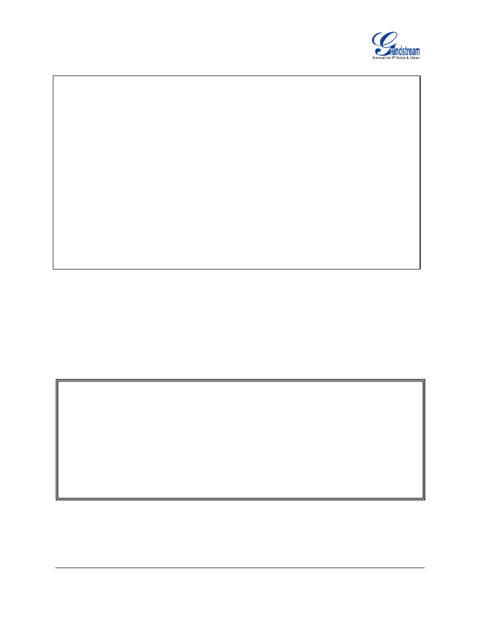
<input name="checkbox1" value="Dog" type="checkbox" label="Dog" >
<styles pos_x="5" pos_y="50"/>
</input>
<input name="checkbox2" value="Cat" type="checkbox" label="Cat" >
<styles pos_x="5" pos_y="65"/>
</input>
<input name="checkbox3" value="Bird" type="checkbox" label="Bird" >
<styles pos_x="5" pos_y="80"/>
</input>
<input name="checkbox4" value="Rabbit" type="checkbox" label="Rabbit" >
<styles pos_x="5" pos_y="95"/>
</input>
<select name="
List Name
">
<styles pos_x="
X location
" pos_y="
Y location
" />
<items>
<item value="
value 1
">
item 1 string
</item>
<item value="
value 2
">
item 2 string
</item>
<item value="
value 3
">
item 3 string
</item>
<item value="
value 4
">
item 4 string
</item>
</items>
</select>