MacroSystem Title-Studio User Manual
Page 14
Chapter 9
Formatting with colors, patterns or
materials
Many menus with design functions refer to a menu that gives
you the ability to choose between a color, a pattern or a mate-
rial. This goes hand in hand with further settings in the menu.
These settings can be found when designing a text style, the
background of a box or text shadows. This menu will now be
explained in general.
In order to make the selection, you must first click on the small
switch areas for colors, patterns or materials. Next, you must
click on the larger preview image in the menu. This is where
the currently selected setting is displayed.
Click on this preview image to open the menu for the design
element you have selected.
Color: When you want to select a color, you can do this in the
„Select color“ menu. You know this menu from using the Bog-
art SE basic software. If you are not familiar with it, we suggest
you refer to your Bogart manual.
Pattern: You also already know the menu to select patterns.
You may know it from Bogart SE and its Pattern effect to
create an „empty scene“ or from the creation of menus in
Arabesk.
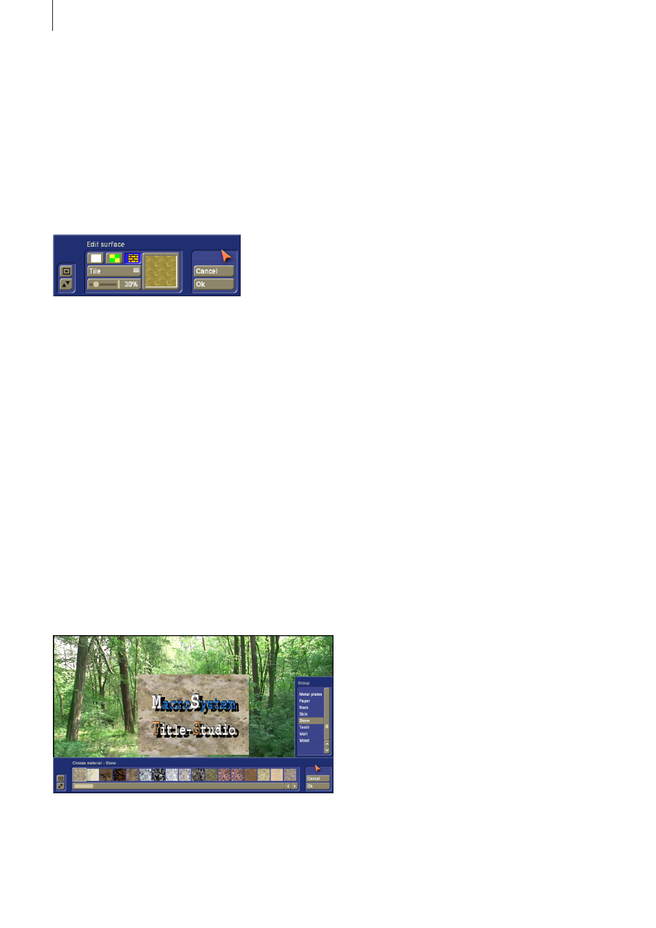
Material: When you want to select such a property, you should
switch to the „Select material“ menu. The menu can be positi-
oned close to the upper or bottom screen border. That depen-
ds on your last position. The menu is divided in a horizontal
and a vertical area.
At the start, the vertical menu is interesting. It will always be
shown on the right in what follows. In this selection, you will
find the group arrangement. For more clarity, each group has
been assigned specific materials. When you look for a speci-
fic property, such as a stone wall, you should look in the list
of groups for a group called „Stone“. You could also look for
a group called „Wall“. When you have selected a group, the
contents of the horizontal menu will change. This is where the
materials stored in the group you selected are listed using pre-
view images. When you select one of the images, the material
will immediately be applied to your text example, so that you
may see the result. This way, you can quickly see if the choice
meets your expectations.
However, should you be looking for something with water, you
could find something in the Element group.
Once you have assigned a material or a pattern, you can deter-
mine the placement on the characters.
Symmetrical: The chosen pattern or material will be scaled
and adapted to the largest possible character. The application
to other characters is based on this and they are covered with
the pattern/material accordingly. This way, the image content
lies on each character in just the same position and has the
same size.
Asymmetrical: The chosen pattern or material will be scaled in
the best possible way to each character. As a result, the cha-
racter exhibits other parts or sizes of the pattern/material.
Freely scaled: Use the slider below to vary the size of the
structure and therefore the look of the characters. When the
structure becomes smaller than the character, the remaining
areas of the character will remain free.
Tiled: Use the slider below it to vary the size of the structure
image and therefore the look of the characters. If the size of
the structure is smaller than the character, it will be repeated
next to it. This will lead to a tiling of the structure in the
character.
9 .1 Transparency
Once you have assigned a pattern or a color to the object, you
can assign this selection an alpha value, i.e. a transparency.
Transparency can be quite useful for some settings.
This can be very useful when defining a shadow, to make sure
that the shadow does not dominate the text itself.
The background of a box can also be made somewhat trans-
parent. This way, the scene content behind it will still be reco-
gnizable. When an alpha value of 0% is set for the background
of a table, it has no visible background and the text is placed
direct on the scene.
Even when using a text style, it can be useful to work with
transparency.
When you make the surface a little more transparent, the bor-
der, or the 3D effect of the text becomes stronger. This can be
used as a particular stylistic tool. When you set the alpha value
for the surface to 0%, the text surface becomes completely
14