User’s guide – X-Treme Audio XT-NET User Manual
Page 11
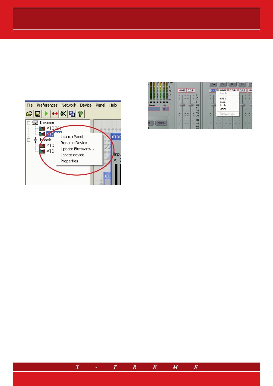
11. DEVICE CONTEXT MENU
By right-clicking on the node of a device in the Tree, a ‘context menu’
will appear, providing you with the following possible actions:
Launch Panel - launches the control panel for this device
Rename Device - allows the Device Name to be changed
Update Firmware - update firmware in this device
(see Device Firmware)
Locate Device - to locate this device (e.g. led flashing)
Properties - lists device details which may be of interest for
maintenance.
If you do not wish to select any actions from the context menu, it
can be dismissed by pressing the ESC key, or by clicking the mouse
anywhere else in the application window.
12. CONTROL PANELS
Each panel will have a complete set of controls relating to the ad-
justable parameters within the device. Each control will contain the
current parameter value (see Parameter synchronisation). In some
panels, Tabs are used to distinguish between different sections of
the device. Single parameters may be adjusted “live” whilst online.
Also see Controls. Panels will often have a tool bar, with buttons for
executing commonly used functions such as File Open, File Save,
Locate and Help (see Tool Bar).
13. MONICONS
Monicons are a condensed representation of a device, which show
some monitoring status information, but few or no controls. Since
these are quite small, they are a convenient way of arranging the de-
vices on the main window in a manner meaningful to the application.
Clicking the ‘>’ button will cause the full control panel for the device
to be displayed.
14. CONTROLS
Controls have standardised properties that allow them to work in a
consistent way across various control panels for different devices.
Many controls will allow the mouse wheel to be used for fine adjust-
ments, or the keyboard as an alternative (see Keyboard Shortcuts).
When using the keyboard or the mouse wheel, it is necessary to have
the control in question ‘in focus’. You can bring a control into focus
either by tabbing to it (using the Tab key), or by clicking on it with the
mouse. Focus is often shown as a dotted rectangle around part of
the control, or by the text in a control being highlighted, or by a solid
outline being added to a button.
Some controls may allow the units of measurement used for display-
ing and adjusting values to be changed, such as Equaliser Band-
widths (which may be shown in Octaves or Q) or Delays, which may
be shown in distance or delay units. The units of measurement are
selected in the Preferences menu (see Menu).
14.1 Drop-Down Selector boxes
These are for selecting one item from a number of possibilities in a list.
Click the arrow on the right-hand end of the control to cause it to dis-
play a list of the options. Click on the text for that option to select it. If
there are many options to choose from, a scroll-bar will be shown, al-
lowing you to scroll up and down the list by clicking the scroll arrows.
Note that once the control is highlighted, the PGUP, PGDN and Arrow
keys or the mouse wheel may also be used to change the selection.
14.2 Spin boxes
The value would normally be adjusted by clicking on the top button to
increase the displayed value, or on the bottom button to reduce the
displayed value. Holding the mouse button whilst on a button will after
a short delay cause the repeat mechanism to repeatedly increment or
decrement the value. Alternatively, values may be typed into the value
box directly. To do this, click in the value box and type in the new value.
The value you type in may include a minus sign, a decimal point, and/
or an engineering multiplier, such as ‘k’ to signify a multiplication of
1000. This may appear at the end of the typed string, or may be used
instead of a decimal point (such as 6k2 to mean 6200). Some controls
may auto-range as the value changes. For example, delay controls in
distance mode may change from mm to m as the distance increases
beyond 999 mm. If you wish to type a value into such a control, then
metres will be assumes unless you specify mm (such as “53mm”). For
the value to be accepted, you can either click outside the control (such
as on another control), or press the Enter key. Once Control button is
highlighted, the PGUP, PGDN and Arrow keys or the mouse wheel may
also be used to adjust the value.
14.3 Buttons
Buttons generally have two states; pressed (active) and non-pressed
(inactive). Generally, the button will apply the condition that is labelled
when it is pressed. The space bar may be used to activate a button
which is in focus.
14.4 Radio buttons
These are laid out in mutually exclusive groups to select one of a
number of options. Press the radio button to select it, which will
cause any other button in the group to be deselected. Once a control
in the group is highlighted, the PGUP, PGDN and Arrow keys may
also be used to change the selection.
11/15