Grass Valley Xpanel Vertigo Suite v.4.8 User Manual
Page 43
Xpanel User Manual
4-9
Building and editing panels
Button
Adding a Button primitive creates a button object, which is most often
associated with the O
N
C
LICK
event. When an operator clicks the button,
actions are executed that affect the playout’s content and/or behavior.
By default, Button primitives are configured to one state since the C
HANGE
S
TATE
ON
C
LICK
property is set to F
ALSE
(regardless of the value of the
N
UMBER
OF
S
TATES
property).
[Note: Keep as F
ALSE
if you are using tallies.]
If you want the button to toggle between multiple states, set the C
HANGE
S
TATE
ON
C
LICK
property to T
RUE
and set the N
UMBER
OF
S
TATES
property
to the number of states desired (e.g. 3 states = ready, on, off).
The S
TATE
property can be used to set and report the current state of the
button. Accepted values range from 0 to the number of states specified in
the N
UMBER
OF
S
TATES
property.
Text, colors and/or images can be applied to the button to help operators
identify the purpose and/or state of the button.
•
Use the T
EXT
, I
MAGE
N
AME
, I
MAGE
L
OCATION
and/or B
ACK
C
OLOR
properties to edit and specify a main label, background image or
background color for the button (regardless of the button’s state).
Another method for setting the button’s background image is to drag
an image asset from the Asset Browser and drop it directly on the
button object.
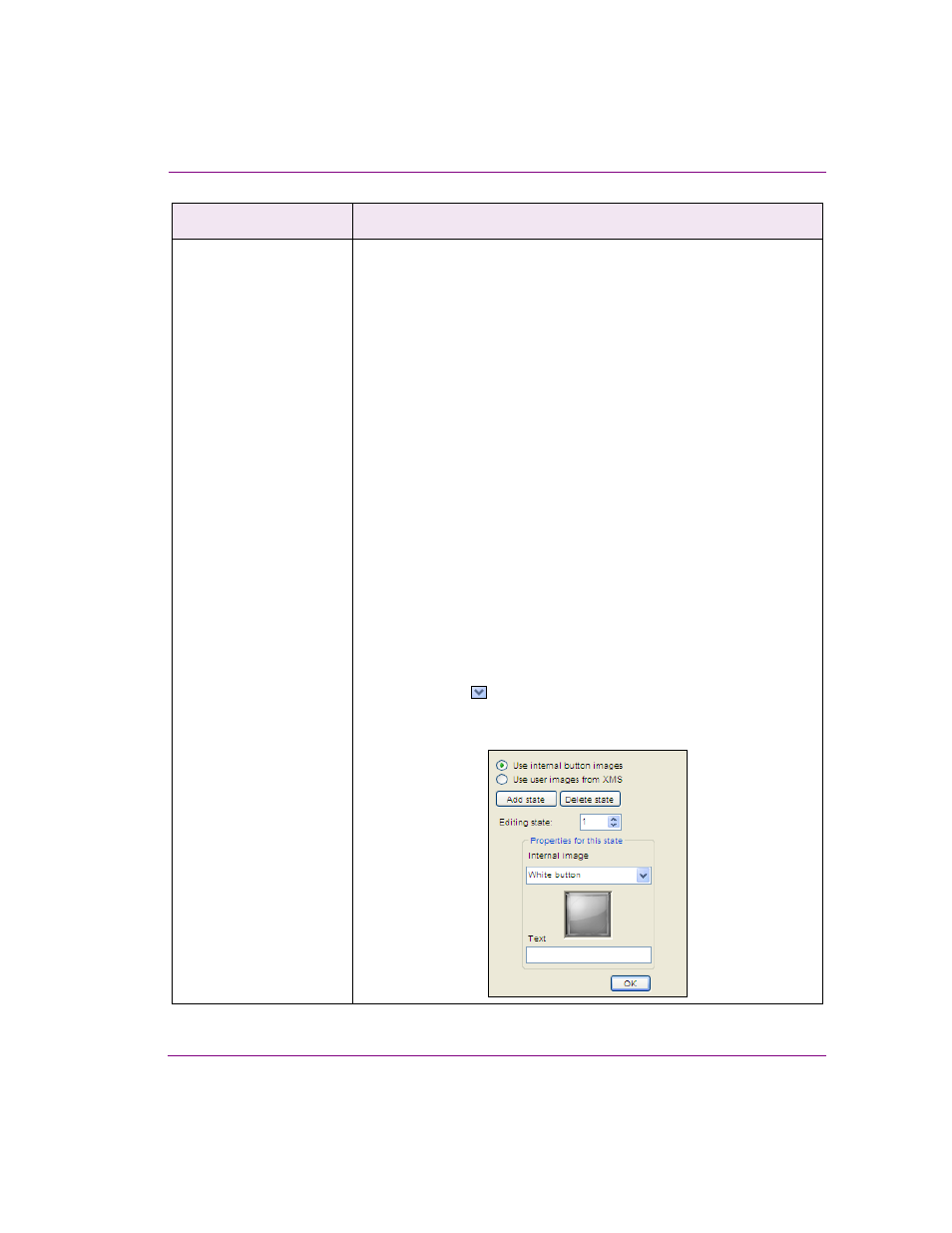
•
Use the I
MAGE
S
TATES
property to specify the background
image/color and text to be used for each button state. Select property
and click the
button, which displays the controls for setting the
image from an internal or XMS source, the background color and/or
the text for each state of the button.
Primitive objects
Description