Use a flush space with justified text, Highlight lines that are too loose or tight – Adobe InDesign CS4 User Manual
Page 275
267
USING INDESIGN CS4
Typography
Before (top) and after (bottom) glyph scaling in justified text
Glyph scaling can help in achieving even justification; however, values more than 3% from the 100% default value
may result in distorted letter shapes. Unless you’re striving for a special effect, it’s best to keep glyph scaling to subtle
values, such as 97–100–103.
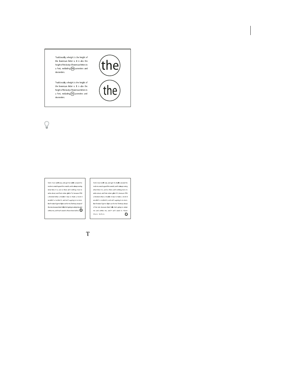
Use a flush space with justified text
Using a flush space character adds a variable amount of space to the last line of a fully justified paragraph—between
the last word and an end-of-story character from a decorative font. Used with nonjustified text, the flush space appears
as a normal word space. In justified text, it expands to absorb all available extra space on the last line. Using a flush
space can make a dramatic difference in the way the entire paragraph is formatted by the Adobe Paragraph Composer.
Before and after adding a flush space character
1 Using the Type tool
, click directly in front of the end-of-story character.
2 Choose Type > Insert White Space
> Flush Space.
Note: The effect of a flush space isn’t apparent until you apply the Justify All Lines option to the paragraph.
Highlight lines that are too loose or tight
Because composing a line of type involves factors in addition to word spacing and letterspacing (hyphenation
preferences, for example), InDesign cannot always honor your settings for word spacing and letterspacing. However,
compositional problems in lines of text can be highlighted in yellow; the darkest of three shades indicates the most
serious problems.
1 Choose Edit > Preferences
> Composition (Windows) or InDesign
> Preferences
> Composition (Mac
OS).
2 Select H&J Violations and click OK.
Updated 18 June 2009