MacroSystem Arabesk Ver.6 User Manual
Page 18
18
Type: This selection button is used to specify the back-
ground type . You can choose between Color, Image, Image
(animated), Scene image and Scene (animated) . Depending
on the type you have selected, the function of the button
next to the selection button also changes . Its purpose is to
select more precise settings for the ‘type’ of background . For
example, if you have chosen Color as the type, the
button
will take you to the dialog field to select the background color .
In the same way, when you have chosen another type, you
will be presented with the corresponding dialog field for the
required settings .
When selecting a scene image or an animated scene, the
button becomes active and you can set brightness, contrast
and color saturation for the active scene or scene image .
Overlay: The Overlay selection button offers you the possi-
bility to place a mask over your background . By combining a
background image (type) with a partly transparent image in
the foreground (overlay), it is possible to design very creative
menu screens . You could, for example, run an animated scene
in the background and put a static mask in the foreground . In
addition to some examples at the end of the ‘Arabesk back-
grounds’, our add-on products BorderX, Moving BorderX,
SplitX (all), TwinX and others can also be used .
None is the default option here . This means that no mask is
placed in the foreground . The
button is not active .
If you'd like to place an overlay, you have the following
options:
Static: Use this option to place a still overlay over your back-
ground image . The
button is now active and you can use it
to select the desired mask .
Animated: This allows you to superimpose an animated over-
lay . Also in this case, the
button becomes active, to make
it possible to select an animated mask (from ‘Arabesk back-
ground’, AnimX, ‘Moving TitleBaX’ . . .) .
Tip: Arabesk always scales backgrounds and overlays to the
full size of the menu. You should try to use images, animations
or scenes that fit the menu resolution as closely as possible, in
order to avoid distortions or blurring. Other graphical elements
or animations can be inserted by means of the Buttons menu, if
you set the button action there to None.
Audio: If you have chosen the ‘Scene (animated)’ option, you
may also play the audio of the scene you selected, by setting
a checkmark . Audio is not played by default, and this function
can only be used for the ‘Scene (animated)’ type .
In case you would like to have sound, but not an animated
scene, you should simply select as a background (with Type)
the scene with the desired sound and place an overlay (static
or animated) without transparency on top of it . The viewer will
then only see the image or the animation, but still have the
sound to go with it .
Should you wish to use an animated scene as the background,
but another sound than your original sound, some preparation
is required .
In order to accomplish this, you should create a sound mix
in the Bogart SE menu and then create a new scene with the
Bogart SE scene function and then save this scene in the
scene bin of the corresponding project . You will then be able
to select this scene in Arabesk 6 to use as a background .
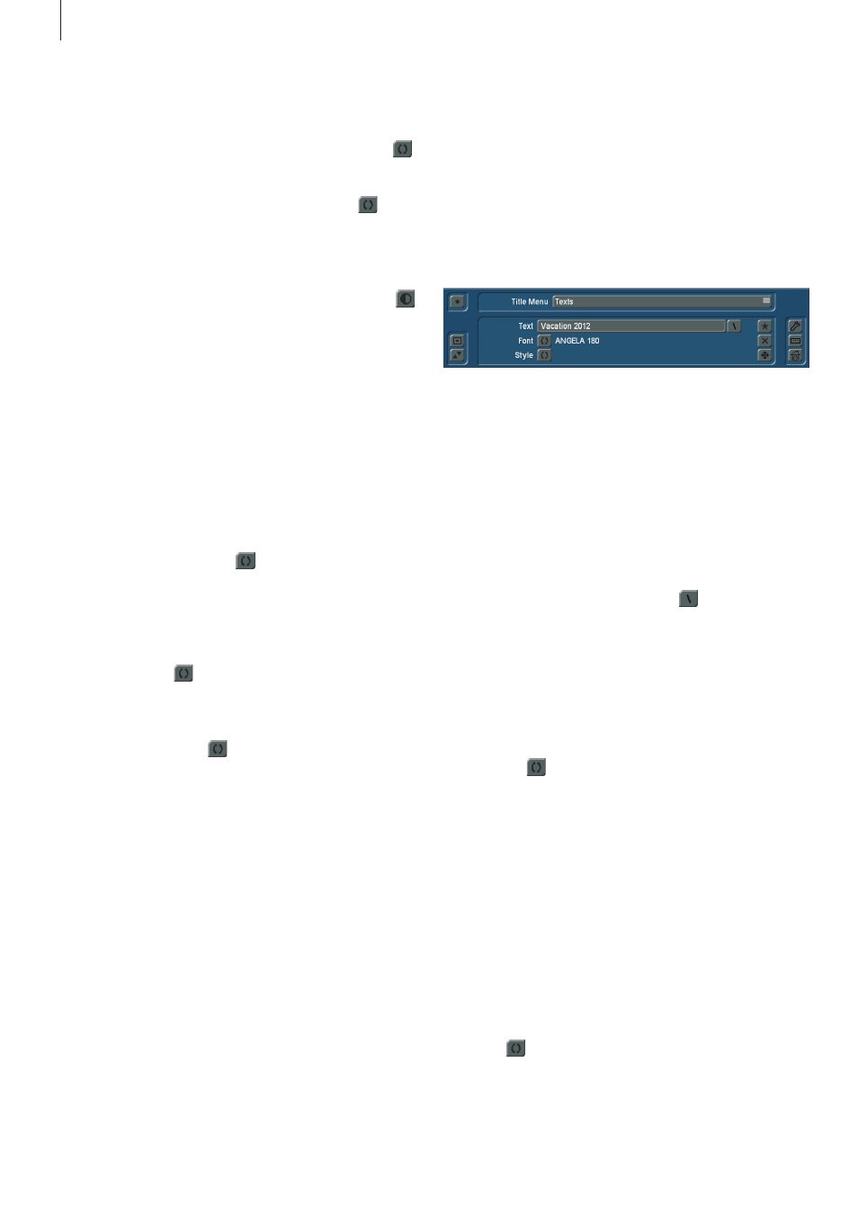
Texts:
The Texts option helps you creating individual main/chapter
texts, such as a title for the main/chapter menu .
Text: Clicking on the Text button activates the keyboard,
which can be used to enter a title, just as usual, after the
existing text was deleted . If you would like to enter a text that
spans several lines, you can make a line break with the Alt
key, and then the Enter key . This will be displayed as an Enter
arrow on the text line . Alternatively, you can also use the key-
board to enter the ‘\n’ schortcut . Instead of the ‘\n’ shortcut, a
line break will be entered in the text .
Next to the Text button, you will find the
button . If you click
on this button, you will see a dialog window with texts that
were saved by default and that you can select to have auto-
matically added to the existing text (without a space) on your
Text button . The shortcut indicated in the dialog field for the
saved text can also be entered directly in the text field . In this
case, you will see the corresponding saved text in the main/
chapter menu .
Font: Use the
button to select the font you desire, as well
as to specify the font size . The currently selected font and the
size are displayed next to the button .
Tip: The size can only be selected in steps of 5 in the selection.
When templates are used, or after a change of the target for-
mat, other values can be used as well, in order to get as close
as possible to the target.
Just as is the case with other font menus, you also have the
possibility here to import fonts or to delete fonts you no longer
need. The ‘Delete fonts’ option is only available for fonts you
have important yourself. Fonts that are available in your device
by default or that have become available thanks to an installed
add-on product, cannot be deleted.
Style: The
button gives you several different possibilities to
design the individual text items .
You have, as is also known from the Bogart SE Titler, the abil-
ity to choose patterns and colors for the text as well as the text
border, using the corresponding button . You can also create