MacroSystem Arabesk Ver.6 User Manual
Page 20
20
a new button in the main/chapter menu, the
button to de-
lete the currently selected buttons in the main/chapter menus,
and the
button to change the position of the currently
selected button by rolling the trackball .
Tip: To insert a new button of a certain type, you must first
insert a button with the given type and then select an image.
Once the button has been inserted, you will be able to select
its type and its image and such, as you like.
When you are in chapter editing, the design window will con-
tain left and right (arrow shaped) buttons, used to go to the
previous or the next screen of the chapter menu. When the
disc is burned, these buttons will be adjusted for the actual
chapter menu. This means that the burned disk will not have
the ‘prev. page’ button on the first page of the chapter menu
and will also not have the ‘next page’ button on the last page
of the chapter menu. As long as you take this into account, you
can easily create all pages along with the first chapter menu
page (when the option ‘Copy changes on all pages’) has been
activated.
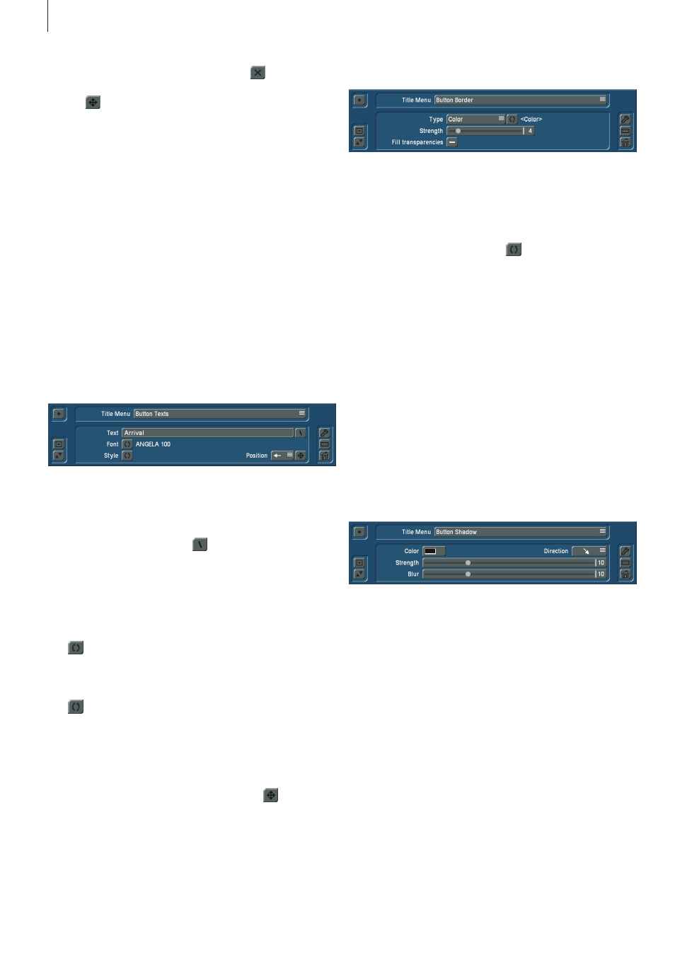
Button texts:
Here, you have the option to modify and design the texts for
the buttons in the main/chapter menu .
To do this, there is the
Text button, which opens the keyboard,
with which you can enter your text as usual . Also here, you
will find after the Text button, a
button, which will open a
dialog window with default texts, to allow you to insert a new
button text in the main/chapter menu . You can also, just as for
the Text option, directly insert the shortcuts displayed before
the default texts in the dialog window in the text field of the
Text button, in order to display the corresponding relevant text
in the main/chapter menu .
The
button after the Font function opens a ‘Choose font’
dialog window in which you can specify the font type as well
as the size of the font . The same extra information is applica-
ble here as for the Text menu (see there) .
The
button next to the Style function gives you, as is the
case for the Text option, numerous ways to design the button
texts .
In addition, you can use the Position selection button to spec-
ify where the text you entered should be displayed next to or
on the corresponding button in the main/chapter menu of the
disc, or freely specify the text position with the
button .
Button borders:
This option for the main/chapter menu is used to use the fol-
lowing three options to modify the design of the button border
of the currently selected button .
Type: The selection button for the Type function includes the
options to select a color or a pattern for the button border . To
select the color or the pattern, the
button next to the Type
selection button opens a dialog field with which you can make
the corresponding settings .
In addition, you have the two following functions:
Strength: Use this slider to modify the strength of the button
border of the currently selected button . When the strength is
set to 0, no border is drawn .
Fill transparencies: By default, there is no checkmark here,
allowing the background in the interspace of the inserted but-
ton to show through (only possible for buttons with images) . If
this is not desired and the face of the button should be filled,
you should put a checkmark next to ‘Fill transparencies’ . In
this case, the interspaces are filled with the color or the pattern
of the button border .
Button shadow:
The ‘Button Shadow’ option for the main/chapter menu makes
it possible for you to design a shadow for the buttons in the
main/chapter menus .
There is a button for the
Color function that opens a dia-
log field to select the color desired for the button shadow .
Semi-transparent black is the default setting .
Use the selection button for the
Direction function to specify
in what direction the button shadow should be thrown (bottom
right is the default setting) .
The strength of the shadow is set with the slider next to the
Strength function .
The
Blur gives you the ability to ‘smudge’ the border of the
button shadow .
Tip: If the strength is set to 0 or the direction to the point, the
shadow is thrown without an offset behind the element and is
only slightly visible with a stronger blur.