2�7�1 day balance – Solare Datensysteme Solar-Log User Manual
Page 30
30
Operating via a web browser within your own network
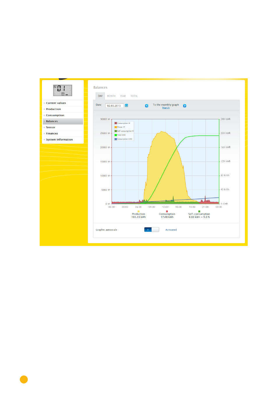
2�7�1 Day balance
The
Day
tab under Balances displays the production, consumption and self-consumption side-by-side as a
day curve. The values at the top left of the graph key can be hidden and unhidden by clicking on them.
Different values with different units are displayed in the graph. The units used and their colors are defined
in the key at the top.
The different values throughout the day can be displayed by moving the mouse along the curve.
Fig.: Daily Balance Graph with the Auto Scaling activated
The meaning of the colored areas in the day curve:
The green areas display the amount of consumption that was covered with PV power. The yellow areas
display the surplus of PV generated power and the red areas display the amount of consumption that was
not covered with PV power.
You have a choice between the
Graph
and
Table
display mode.
Definition of the different colored areas within the balance graphs:
(see figure: Daily Balance Graph)
•
Yellow areas - Production
•
Red areas - Consumption (Total = not covered by production (red in the graph) + covered by pro-
duction (green in the graph).
•
Green area - self-consumption (covered by production - green in the graph) with a percentage (in
relation to production).