Button specification – Grass Valley NV9641A v.1.0 User Manual
Page 36
26
Configuration
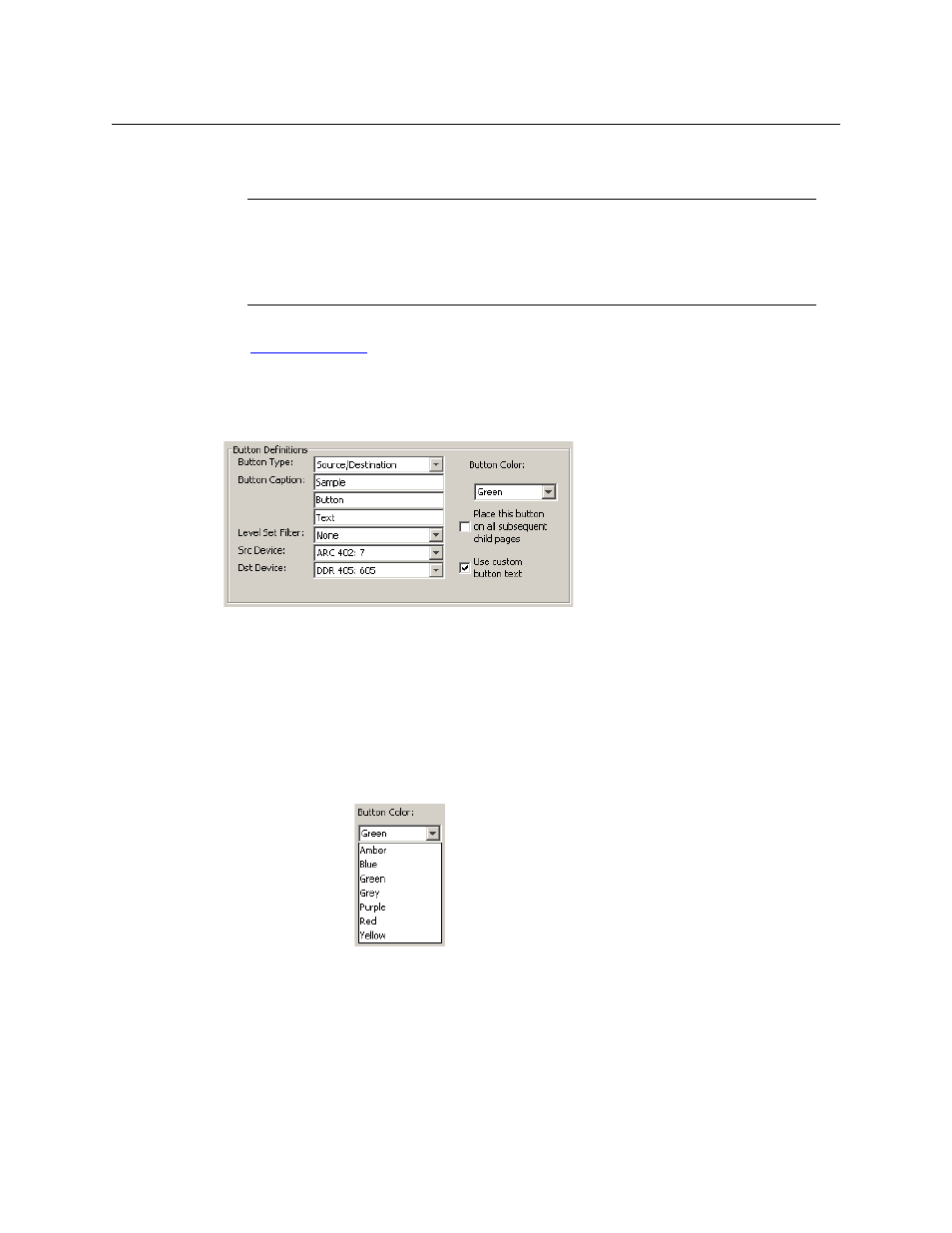
Button Definitions
When a device list appears on the panel, the system lights the ‘up’ button so the operator
can easily return to the page containing the category button.
There are different sets of button types for global suffix pages and for global navigation pages.
See
Button Specification
The button definitions section has several controls:
The controls vary according to the button type.
Button Type
A pull-down menu where you may select a button type.
Button Caption
Three text boxes in which you can enter three lines of button text up to 8
characters each. SE provides a default for the button caption.
Some buttons do not allow you to enter button text. Category buttons, for
example, use the category mnemonic as the button text.
Button Color
A pull-down menu where you can select a button color: amber, blue, green,
grey, purple, red, or yellow:
Each of the 7 defined colors has two brightness levels.
Note: in usage, buttons are dark if their functions are disabled. Buttons are
low tally if they are available. Buttons are high tally when they are active.
(An exception to this is the LCD brightness submenu when the panel is in
menu mode.) Some button types are never high-tally.
Note
Certain button fields contain a colon (:) and number after the data in the field. The
number is the record ID of the object in the NV9000 configuration database. The
record IDs can be ignored but might be of some use when the configurer is searching
for items in the configuration database.