Creating the chart – SMA Sunny Data Control V.4.2 User Manual
Page 124
Managing Data and Saving Data Locally
SMA
Technologie AG
Page 124
SDC-TEN080642
User Manual
Creating the Chart
8.
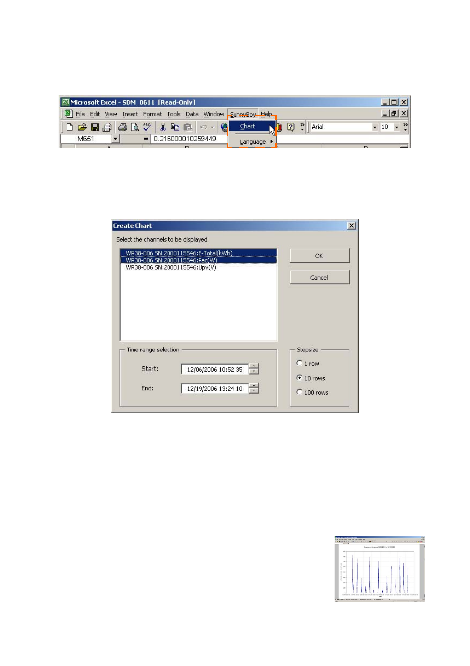
In Excel, select "Sunny Boy / Chart" (see figure below).
The window "Create chart" opens.
9.
From the list, select the channels which are to be displayed in the chart, by clicking
on the channel names. Several channels can be selected. The selected channels
are highlighted in color.
10. Make the desired settings for display of the chart.
Start and End: start and end (dates and times) of the interval, from which data are
to be displayed. Take care to choose a display interval which is not too large, as
Excel can display a maximum of 4000 data sets in one chart.
Increment: indicates the increment in rows, from which the measured values are to
be taken. For example, with "10 rows", only every tenth row of the measured val-
ues is included.
11. Click on <Ok>. The chart is displayed.
Example
Example chart