Button definitions – Grass Valley NV9000-SE v.5.0 User Manual
Page 357
339
NV9000-SE Utilities
User’s Guide
Button Definitions
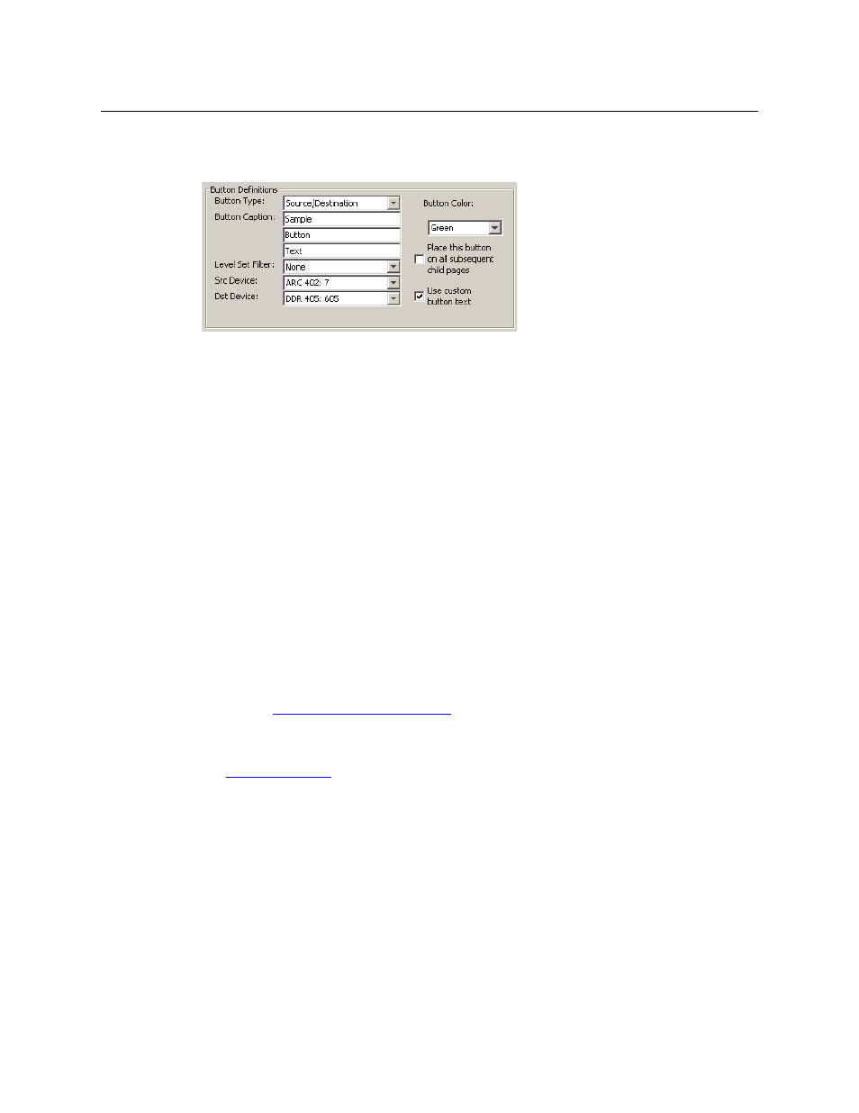
The button definitions section has several controls:
The controls vary according to the button type.
Button Type
A pull-down menu where you may select a button type.
Button Caption
Three text boxes in which you can enter three lines of button text up to 8
characters each.
Button Color
A pull-down menu where you can select a button color: amber, blue, green,
grey, purple, red, or yellow.
Check box
“Place this button on all child pages.” If you check this option, the button
you are defining will occur, in the same position, on all pages in the subtree
available through the navigation button. A “back” button is a good candi-
date for such a button. The back button returns the operator to the
previous page.
Check box
“Use custom button text.” Check this box if you want to override the
button’s default text. This checkbox is not present for all button types.
When you choose a button type, additional drop-down menus can appear, depending on the
button type, allowing you to further specify the button’s behavior. Available options and selec-
tions vary from button type to button type.
The ‘Navigate’ button is unique: during configuration, it initiates a dialog in which you create a
button subtree. During operation, it switches the panel to the button page associated with the
button. See
‘Edit Navigation Button’ Dialog
Some buttons are generated dynamically during operation.
There are different sets of button types for global suffix pages and for global navigation pages.
See