MacroSystem Bogart SE Ver.4 User manual User Manual
Page 59
59
Bogart SE 4 User manual
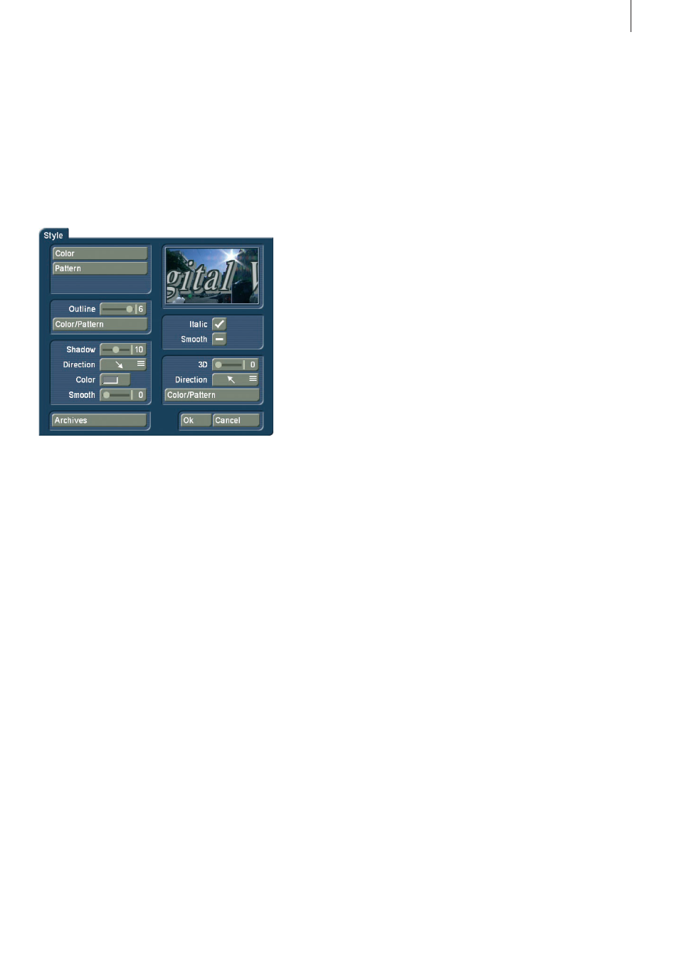
• A click onto the “Style” button opens another screen. Here,
you can see a preview to the right displaying a smaller version
of your video . The text part and background are related to the
position of the text cursor . If you have not yet entered text, the
system displays some other letters . In the top left corner, de-
cide which pattern is to be used for the text . Press “Color” for
the color box or “Pattern” to open the “Select pattern” screen .
In this screen you can select a pattern of your choice, just as
described in section 3 .2 under “Image pool” . The mode (posi-
tive/negative) and alpha value can also be specified .
Clicking on “OK” in “Select pattern” confirms your settings and
you are returned to the “Style” menu . Now you can see the
“Outline” button . With the aid of the slider next to it, define the
strength of the outline with values between 0 (not active) and
6 (strong) . The “Color/Pattern” button leads you to the image
pool, in which you can decide if the outline is to consist of a
pattern or color .
In the box below, you should see the “Shadow” button . Use
it to determine a width between even values of 0 to 20 . The
“Direction” and “Color” of the shadow can now also be deter-
mined . The slider for “Blur” allows you to change the outline of
the shadow to a blur type effects and thus make it look more
realistic .
In the right area of the screen, you can see the function “Italic” .
You can activate it by selecting the empty box next to it . The
button “Smooth” is use to apply a slightly smeared look to the
text . It also may help to weaken any unwanted artefacts result-
ing from video compression .
Below, you can see the “3D” option . The strength of the three-
dimensional effect can be set with even values between 0 and
20 using the slider . The effect makes the letter look as if they
had a certain thickness . If you use higher values, make sure
to set a character space of around 120% so that the 3D effect
does not interfere with the letters themselves . The “direction”
can be set to four different possibilities . The arrow pointing
towards the left top direction is recommended .
The structure of the effect can be set using the “Color/Pattern”
button . It is recommended to use a tone similar to the text
color, yet with brightness between this and the background
color’s .
Below left, in the “Style” screen, you can see the “Archives”
button . The Archives allow you to save the styles you have
created . You will also find some examples of styles that come
with the software . The Style screen can be closed by pressing
the “OK” button (meaning that you confirm the settings made)
or by pressing “Cancel” .
• Clicking in the text entry operation panel on the “Line” but-
ton opens a window in which the functions “Character width”,
“Character space”, “Alignment”, “Line space” and “Delete
active line” are listed .
You can see that the settings of the buttons with percent
values lie between 50% and 200%, whereby 100% corre-
sponds to the default setting . Use the function Charwidth to
change the width of letters and punctuation marks of a line . In
the Enter/edit text screen, click anywhere in the line of text to
be edited . Then select the button “Line” and under “Character
width” enter the desired percentage . Click on “OK” to observe
the result . The letters have become wider (> 100%) or narrower
(< 100%), depending on the percent given, and the entire line
has become either longer or shorter . The individual words in
a line cannot be formatted separately . The settings apply only
to the entire line . The function “Character space” increases
or decreases the space between the letters while the width
of the individuals letters remains unchanged . In the Enter/edit
text screen, click anywhere in the line of text to be edited and
select the button “Line” . Use the “Character space” slider to
enter the desired distance percentage .
The line is stretched (> 100%) or narrowed (< 100%), depend-
ing on the percent value given . The individual words in a line
cannot be formatted separately . The settings apply only to the
entire line . Under the selection button “Alignment” you can
specify whether the line should be formatted “left”, “centered”
or “right” . With the function “Line space” you can specify the
distance between the selected line and the line below it .
Click on the line that lies above the line to be changed . Now
select “Line” and under “Line space” change the default
value (=100%) to another value . If your percentage number is
smaller, then the line below moves closer to the selected line .
If your percentage number is larger, then the line slides farther
away toward the bottom from the selected line . The lines
below the moved line are moved along with it, but keep their
respective distances . You can also make several settings to-
gether in the “Line” window before clicking on “OK” . Note that
the settings always apply to the line selected beforehand . The
percentages you have set are retained . You can view the set-
tings and changes for the line you have selected by activating
the “Line” window . Here you can also modify the percentages .