Figure 57, Figure – H3C Technologies H3C Intelligent Management Center User Manual
Page 121
107
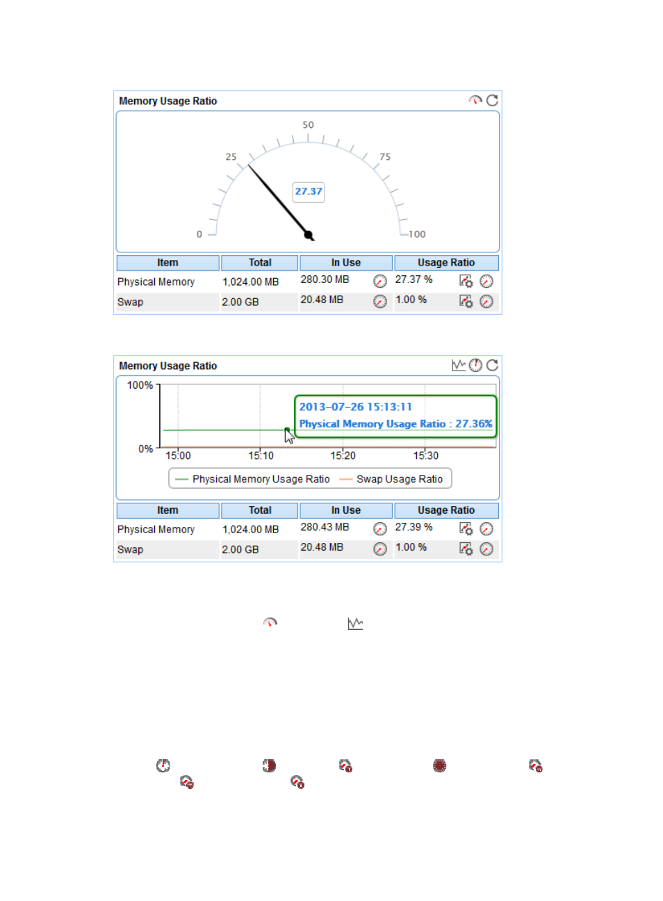
Figure 57 Memory Usage Ratio—Dashboard area layout
Figure 58 Memory Usage Ratio—Trend graph area layout
Memory Usage Ratio area fields:
•
Memory Usage Ratio dashboard or trend graph—View the area in a dashboard or a trend graph.
Click the Dashboard icon
or Trend icon
on the top right corner to switch between the
graphs.
{
Dashboard graph—View the memory usage ratio of the AIX application in the last APM polling
period.
{
Trend graph—View the changes of the memory usage ratio (including the physical memory
usage ratio and swap memory usage ratio) for the AIX application in a line chart. The green line
is for the physical memory usage ratio and the orange for the swap memory usage ratio. Point
to a spot on the curve to view the memory usage ratio at the specific time point. View the
changes of the memory usage ratio over a specific time period by clicking the Last 1 Hour icon
, Last 6 Hours icon
, Today icon
, Yesterday icon
, This Week icon
, This Month
icon ,
and
This Year icon
. Click the legend names of the different types of memory usage
ratio to display or hide the corresponding monitor indexes.
•
Item—Monitor memory type.