Figure 127, H (see, Figure – H3C Technologies H3C Intelligent Management Center User Manual
Page 193
179
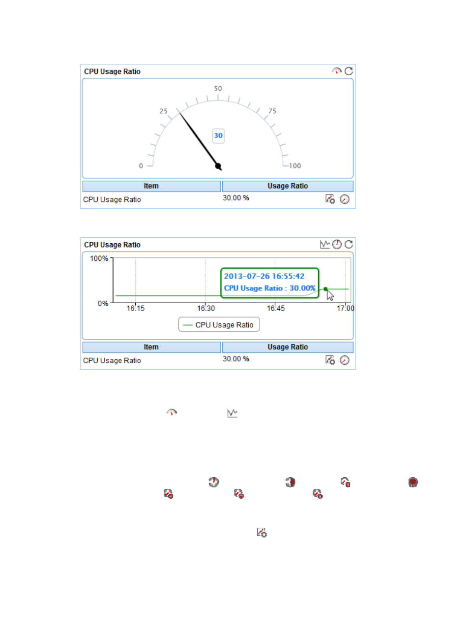
Figure 127 CPU Usage Ratio—Dashboard area layout
Figure 128 CPU Usage Ratio—Trend graph area layout
CPU Usage Ratio area fields:
•
CPU Usage Ratio dashboard or trend graph—View the area in a dashboard or a trend graph. Click
the Dashboard icon
or Trend icon
on the top right corner to switch between the graphs.
{
Dashboard graph—View the CPU usage ratio of the OpenBSD application in the last APM
polling period.
{
Trend graph—View the changes of the CPU usage ratio for the OpenBSD application in a line
chart. Point to a spot on the curve to view the CPU usage ratio at the specific time point.
Authorized users can view the changes of the CPU usage ratio over a specific time period by
clicking the Last 1 Hour icon
, Last 6 Hours icon
, Today icon
, Yesterday icon
,
This Week icon
, This Month icon
, and This Year icon
. The default time period is last
one hour.
•
CPU Usage Ratio—CPU usage ratio of the OpenBSD application in the last APM polling period.
{
Set Threshold—Click the Set Threshold icon
to set alarm thresholds for the CPU usage ratio.
The specified alarm thresholds appear on the CPU Usage Ratio trend graph as dotted lines. The
data is highlighted in orange when the CPU usage ratio reaches the level-1 threshold, and is
highlighted in red when the CPU usage ratio reaches the level-2 threshold. Use the global