H3C Technologies H3C Intelligent Management Center User Manual
Page 505
491
If the check box, shown in
, is selected, the parameter value is true; if not, the parameter value
is false.
Figure 85 Check box view
Example:
<View type="Checkbox"/>
•
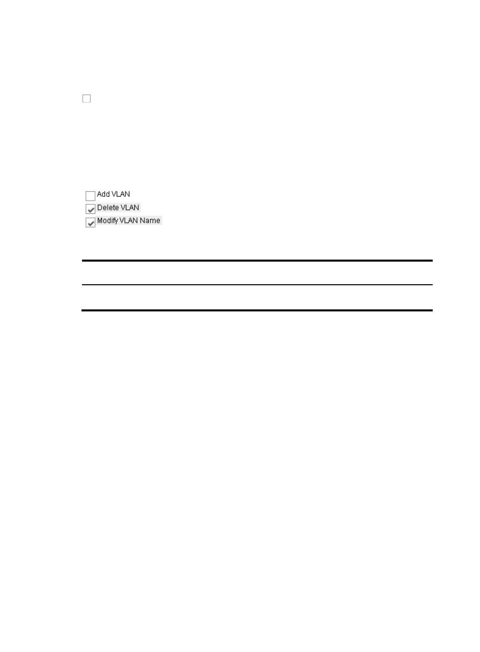
Check box group (SelectManyCheckbox)
A check box group, shown in
, provides you multiple check boxes for selection.
Figure 86 Check box group view
Table 16 Properties of the checkboxes
Property
name
Description Required
Remarks
layout
Layout N
Enumerated value: 1 (horizontal) or 2 (vertical). The default
is 1.
Example:
<View type="SelectManyCheckbox" layout="2">
<SelectItem value="1" displayValue="Fragmentation"/>
<SelectItem value="2" displayValue="Logging"/>
<SelectItem value="3" displayValue="All Source Hosts"/>
</View>
If you select multiple check boxes, as shown on the page above, the parameter takes the string of the
values (separated by " , ") of the selected items, for example 2, 3.
•
Calendar control (PopupCalendar)
The calendar control, shown in
, has the following functions, listed in
•
Allows you to enter date or time in the date input box.
•
Provides date format prompt information.
•
Allows you to change information in the input box by selecting the date and time on the calendar
that appears when you click the icon behind the input box.
•
Provides help information when you click the question mark on the top left corner of the calendar.
•
Allows you to flexibly set the view style of the calendar through the style list file.
•
Automatically changes the language setting based on the specified system environment.