Soft-proof for color blindness (photoshop and, Illustrator) – Adobe Illustrator CS4 User Manual
Page 147
140
USING ADOBE ILLUSTRATOR CS4
Color management
Simulate Black Ink
Simulates the dark gray you really get instead of a solid black on many printers, according to the
proof profile. Not all profiles support this option.
In Photoshop, if you want the custom proof setup to be the default proof setup for documents, close all document
windows before choosing the View
> Proof Setup
> Custom command.
Soft-proof for color blindness (Photoshop and Illustrator)
Color Universal Design (CUD) ensures that graphical information is conveyed accurately to people with various types
of color vision, including people with color blindness. Several countries have guidelines that require CUD-compliant
graphics in public spaces.
The most common types of color blindness are protanopia (reduced sensitivity to red) and deuteranopia (reduced
sensitivity to green). A third of color blind people are affected strongly; the remainder have milder forms of color
blindness.
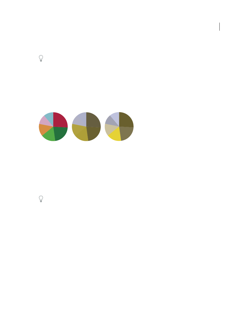
A. Original image B. Color-blind proof C. Optimized design
To determine whether a document is CUD-compliant, do the following:
1
Convert the document to RGB color mode, which provides the most accurate soft-proofs for color blindness.
2
(Optional) To simultaneously view the original document and a soft-proof, choose Window > New Window
(Illustrator) or Window > Arrange > New Window (Photoshop).
3
Choose View > Proof Setup > Color Blindness, and then choose either Protanopia-type or Deuteranopia-type. (To
comply with CUD, check your document in both views.)
In Photoshop, you can print the proof. For more information, search for “Print a hard proof” in Photoshop Help.
If objects are difficult to distinguish in color blind proofs, adjust the design by doing any of the following:
•
Change color brightness or hue:
•
Pure red tends to appear dark and muddy; orange-red is easier to recognize.
•
Bluish green is less confusing than yellowish green.
•
Gray may be confused with magenta, pale pink, pale green, or emerald green.
•
Avoid the following combinations: red and green; yellow and bright green; light blue and pink; dark blue and
violet.
•
Avoid red items on dark-colored backgrounds, or white items on yellow or orange-red backgrounds.
•
Apply different patterns or shapes.
•
Add white, black, or dark-colored borders on color boundaries.
•
Use different font families or styles.
A
B
C