Adjust kerning – Adobe Illustrator CS4 User Manual
Page 326

319
USING ADOBE ILLUSTRATOR CS4
Type
You can automatically kern type using metrics kerning or optical kerning. Metrics kerning (also called Auto kerning)
uses kern pairs, which are included with most fonts. Kern pairs contain information about the spacing of specific pairs
of letters. Some of these are: LA, P., To, Try, Ta, Tu, Te, Ty, Wa, WA, We, Wo, Ya, and Yo. Metrics kerning is set as
the default so that specific pairs are automatically kerned when you import or type text.
Some fonts include robust kern-pair specifications. However, when a font includes only minimal built-in kerning or
none at all, or if you use two different typefaces or sizes in one or more words on a line, you may want to use the optical
kerning option. Optical kerning adjusts the spacing between adjacent characters based on their shapes.
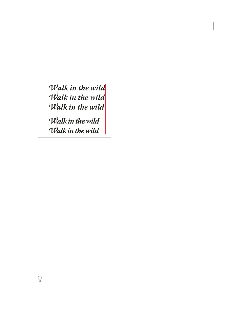
Kerning and tracking options
A. Original text B. Text with optical kerning C. Text with manual kerning between W and a D. Text with tracking E. Cumulative kerning
and tracking
You can also use manual kerning, which is ideal for adjusting the space between two letters. Tracking and manual
kerning are cumulative, so you can first adjust individual pairs of letters, and then tighten or loosen a block of text
without affecting the relative kerning of the letter pairs.
When you click to place the insertion point between two letters, kerning values appear in the Character panel. Metrics
and optical kerning values (or defined kern pairs) appear in parentheses. Similarly, if you select a word or a range of
text, the tracking values appear in the Character panel.
Tracking and kerning are both measured in 1/1000 em, a unit of measure that is relative to the current typeface size.
In a 6-point font, 1 em equals 6 points; in a 10-point font, 1 em equals 10 points. Kerning and tracking are strictly
proportional to the current typeface size.
Note: Values for kerning and tracking affect Japanese text, but normally these options are used to adjust the aki between
roman characters.
Adjust kerning
❖
Do any of the following:
•
To use a font’s built-in kerning information for selected characters, select Auto or Metrics for the Kerning option
in the Character panel.
•
To automatically adjust the spacing between selected characters based on their shapes, select Optical for the
Kerning option in the Character panel.
•
To adjust kerning manually, place an insertion point between two characters, and set the desired value for the
Kerning option in the Character panel. (Note that if a range of text is selected, you can’t manually kern the text.
Instead, use tracking.)
Press Alt+Left/Right Arrow (Windows) or Option+Left/Right Arrow (Mac OS) to decrease or increase the kerning
between two characters.
A
B
C
D
E