Cpu usage ratio – H3C Technologies H3C Intelligent Management Center User Manual
Page 142
128
Availability time statistics of a new application monitor are collected since the application monitor was
added. An availability time field does not appear if its value is 0.
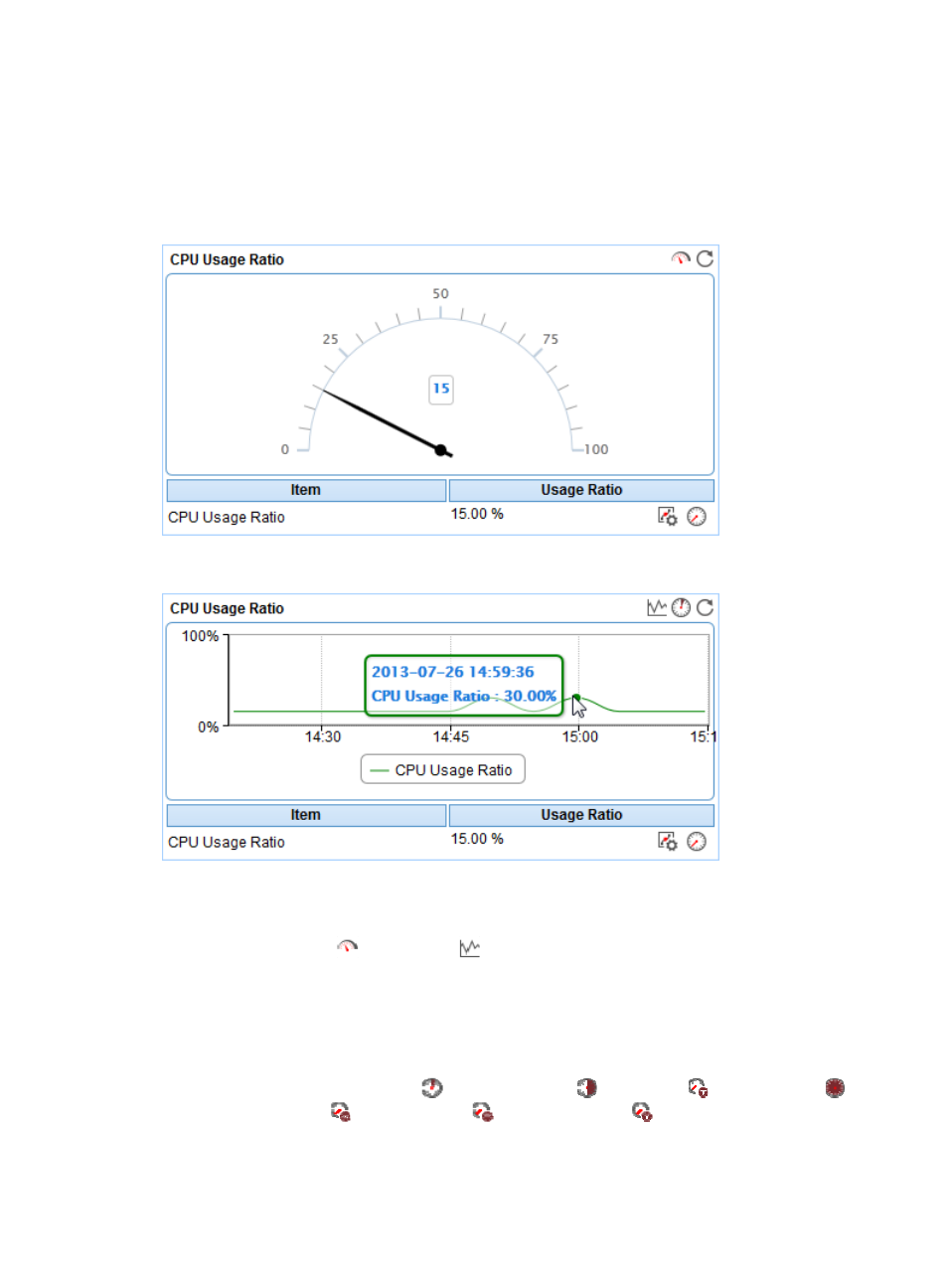
CPU Usage Ratio
The CPU Usage Ratio area layout is shown in a dashboard (see
) or trend graph (see
).
Figure 74 CPU Usage Ratio—Dashboard area layout
Figure 75 CPU Usage Ratio—Trend graph area layout
CPU Usage Ratio area fields:
•
CPU Usage Ratio dashboard or trend graph—View the area in a dashboard or a trend graph. Click
the Dashboard icon
or Trend icon
on the top right corner to switch between the graphs.
{
Dashboard graph—View the CPU usage ratio of the Solaris application in the last APM polling
period.
{
Trend graph—View the changes of the CPU usage ratio for the Solaris application in a line
chart. Point to a spot on the curve to view the CPU usage ratio at the specific time point.
Authorized users can view the changes of the CPU usage ratio over a specific time period by
clicking the Last 1 Hour icon
, Last 6 Hours icon
, Today icon
, Yesterday icon
,
This Week icon
, This Month icon
, and This Year icon
. The default time period is last
1 hour.
•
CPU Usage Ratio—CPU usage ratio of the Solaris application in the last APM polling period.