Connection statistics – H3C Technologies H3C Intelligent Management Center User Manual
Page 250
236
highlighted in red when the buffer hit ratio reaches the level-2 threshold. Use the global
thresholds or custom thresholds. For information about setting the thresholds, see "
." Higher buffer hit ratio indicates better performance. Select Less
than or equal to for the Threshold Condition field.
{
History Record—Click the History Record icon
to view the history graph of the buffer hit
ratio trend. Point to a spot on the curve to view the buffer hit ratio at the specific time point.
Authorized users can view buffer hit ratio statistics over the last 1 hour, last 6 hours, today,
yesterday, this week, this month, and this year by clicking the corresponding icons on the upper
right of the graph.
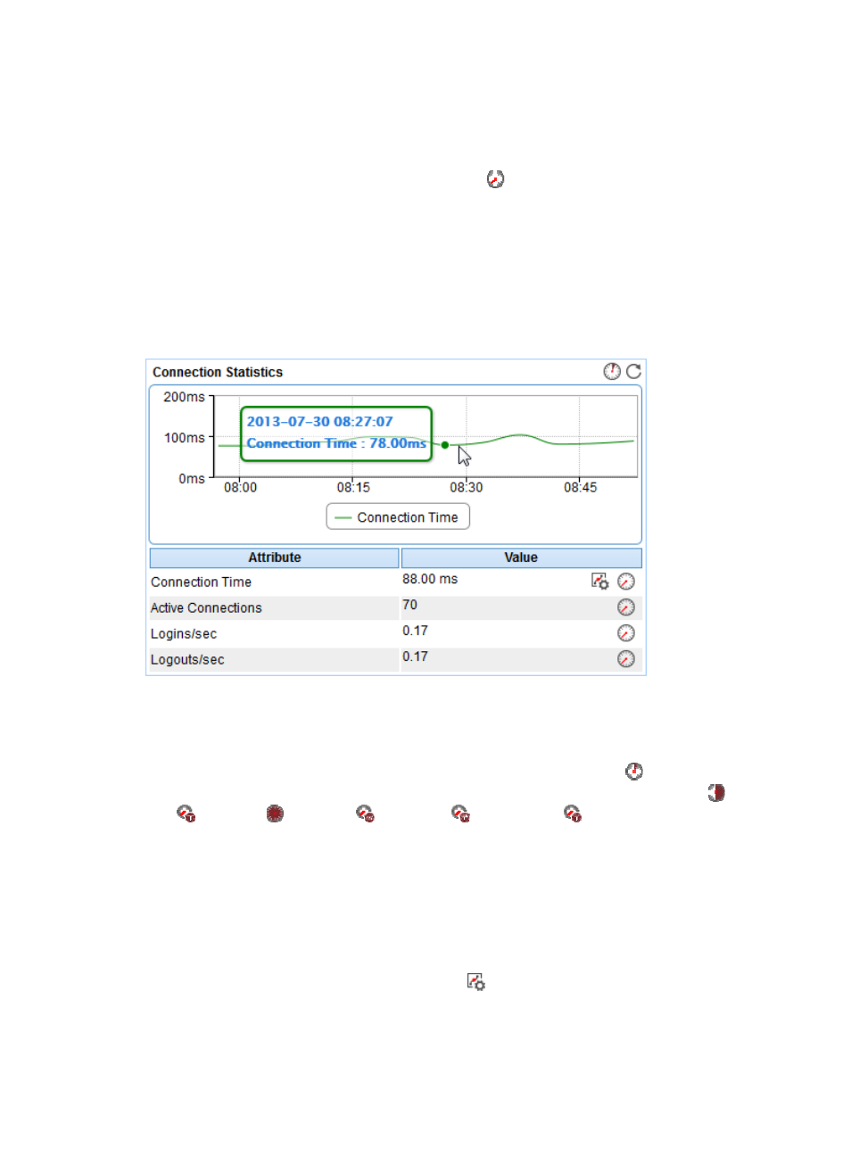
Connection Statistics
The Connection Statistics area layout is shown in
Figure 186 Connection Statistics area layout
Connection Statistics area fields:
•
Connection Time trend graph—Shows the connection time trend of the SQL Server over the last 1
hour in a line chart. Point to a spot on the curve to view the connection time of the SQL Server at the
specific time point. To change the report period, click the Last 1 Hour icon
on the upper right of
the graph, and then select an icon from the list. Available options include Last 6 Hours
, Today
, Yesterday
, This Week
, This Month
, and This Year
.
•
Attribute/Value—Monitor index name and data that was obtained when APM last polled the SQL
Server.
{
Connection Time—Time consumed when APM established the connection with the SQL Server.
{
Active Connections—Number of connections between the SQL Server and its users.
{
Logins/sec—Number of newly established connections per second.
{
Logouts/sec—Number of terminated connections per second.
{
Set Threshold—Click the Set Threshold icon
to set alarm thresholds for the connection time.
The specified alarm thresholds appear on the Connection Time trend graph as dotted lines. The
data is highlighted in orange when the connection time reaches the level-1 threshold, and is
highlighted in red when the connection time reaches the level-2 threshold. Use the global