Cpu usage ratio – H3C Technologies H3C Intelligent Management Center User Manual
Page 176
162
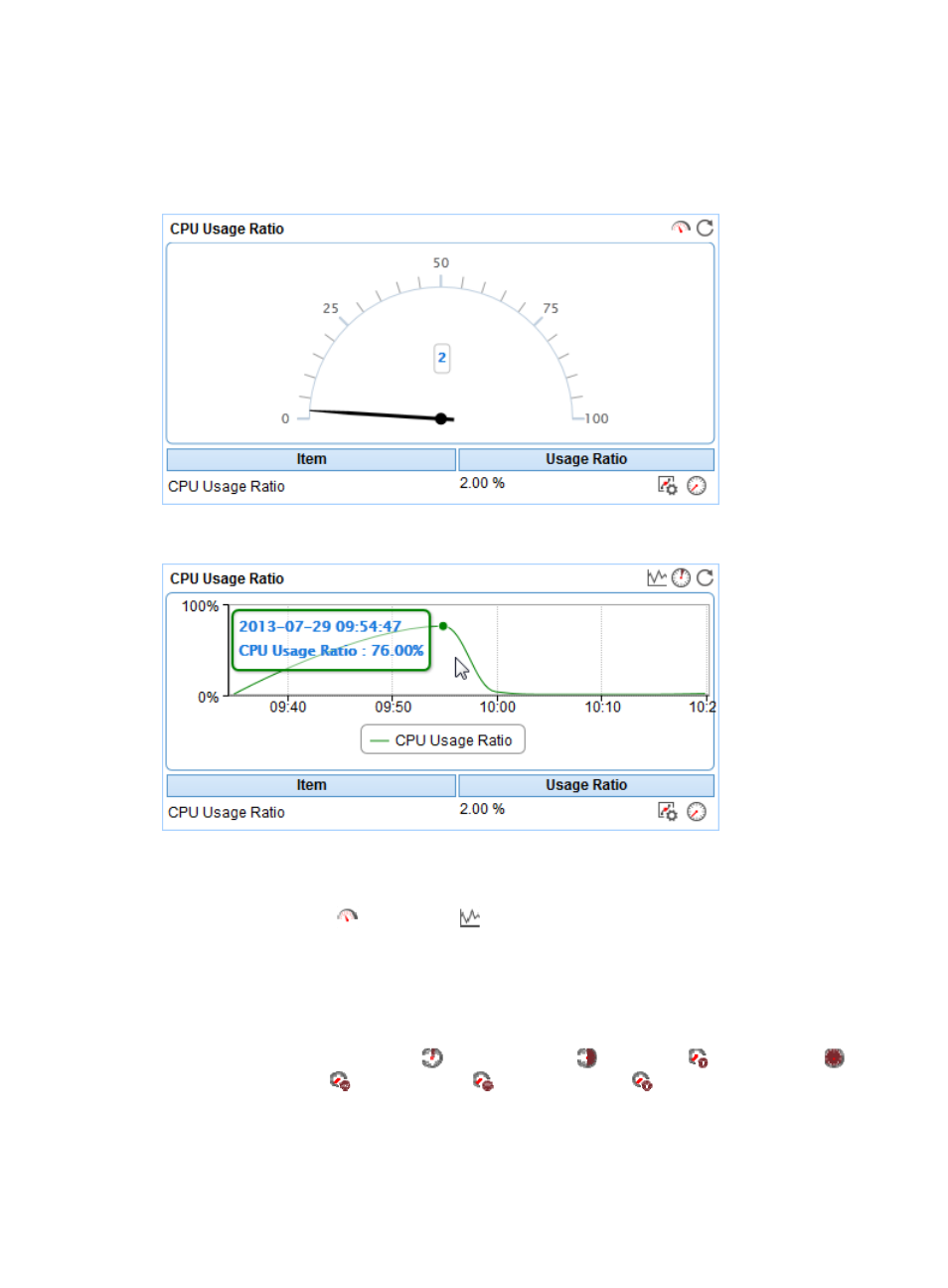
CPU Usage Ratio
The CPU Usage Ratio area layout is shown in a dashboard (see
).
Figure 109 CPU Usage Ratio—Dashboard area layout
Figure 110 CPU Usage Ratio—Trend graph area layout
CPU Usage Ratio area fields:
•
CPU Usage Ratio dashboard or trend graph—View the area in a dashboard or a trend graph. Click
the Dashboard icon
or Trend icon
on the top right corner to switch between the graphs.
{
Dashboard graph—View the CPU usage ratio of the Mac OS application in the last APM
polling period.
{
Trend graph—View the changes of the CPU usage ratio for the Mac OS application in a line
chart. Point to a spot on the curve to view the CPU usage ratio at the specific time point.
Authorized users can view the changes of the CPU usage ratio over a specific time period by
clicking the Last 1 Hour icon
, Last 6 Hours icon
, Today icon
, Yesterday icon
,
This Week icon
, This Month icon
, and This Year icon
. The default time period is last
one hour.
•
CPU Usage Ratio—CPU usage ratio of the Mac OS application in the last APM polling period.