File system usage ratio – H3C Technologies H3C Intelligent Management Center User Manual
Page 679
665
•
Server Memory Usage dashboard or trend graph—View the area in a dashboard or a trend graph.
Click the Dashboard icon
or Trend icon
on the top right corner to switch between the
graphs.
{
Dashboard graph—Shows the memory usage of the KVM server in the last polling period.
{
Trend graph—Shows the memory usage trend of the KVM server over a specific time range in
a line graph. By default, the graph shows the last hour data. Point to a spot on the curve to view
the memory usage of the KVM server at the specific time point. To change the report period,
click the Last 1 Hour icon
on the upper right of the graph, and then select an icon from the
list. Available options include the Last 6 Hours icon
, Today icon
, Yesterday icon
,
This Week icon ,
This Month icon
, and This Year icon
.
•
Total—Total memory size of the KVM server in the last polling period.
•
Free—Free memory size of the KVM server in the last polling period.
•
Buffer—Buffer memory size of the KVM server in the last polling period.
•
Cache—Cache memory size of the KVM server in the last polling period.
•
Usage—Memory usage of the KVM server in the last polling period.
•
Set Threshold—Click the Set Threshold icon
in the Usage field to set alarm thresholds for the
memory usage. The specified alarm thresholds appear on the memory usage trend graph as dotted
lines. The memory usage ratio is highlighted in orange when it reaches the level-1 threshold, and is
highlighted in red when it reaches the level-2 threshold. Use the global thresholds or custom
thresholds. For information about setting thresholds, see "
•
History Record—Click the History Record icon
to view the history trend for the KVM application.
By default, the graph shows the last hour statistics. To change the report period, click the Last 6
Hours icon ,
Today icon ,
Yesterday icon ,
This Week icon ,
This Month icon ,
or
This Year icon
on the upper right of the graph as needed.
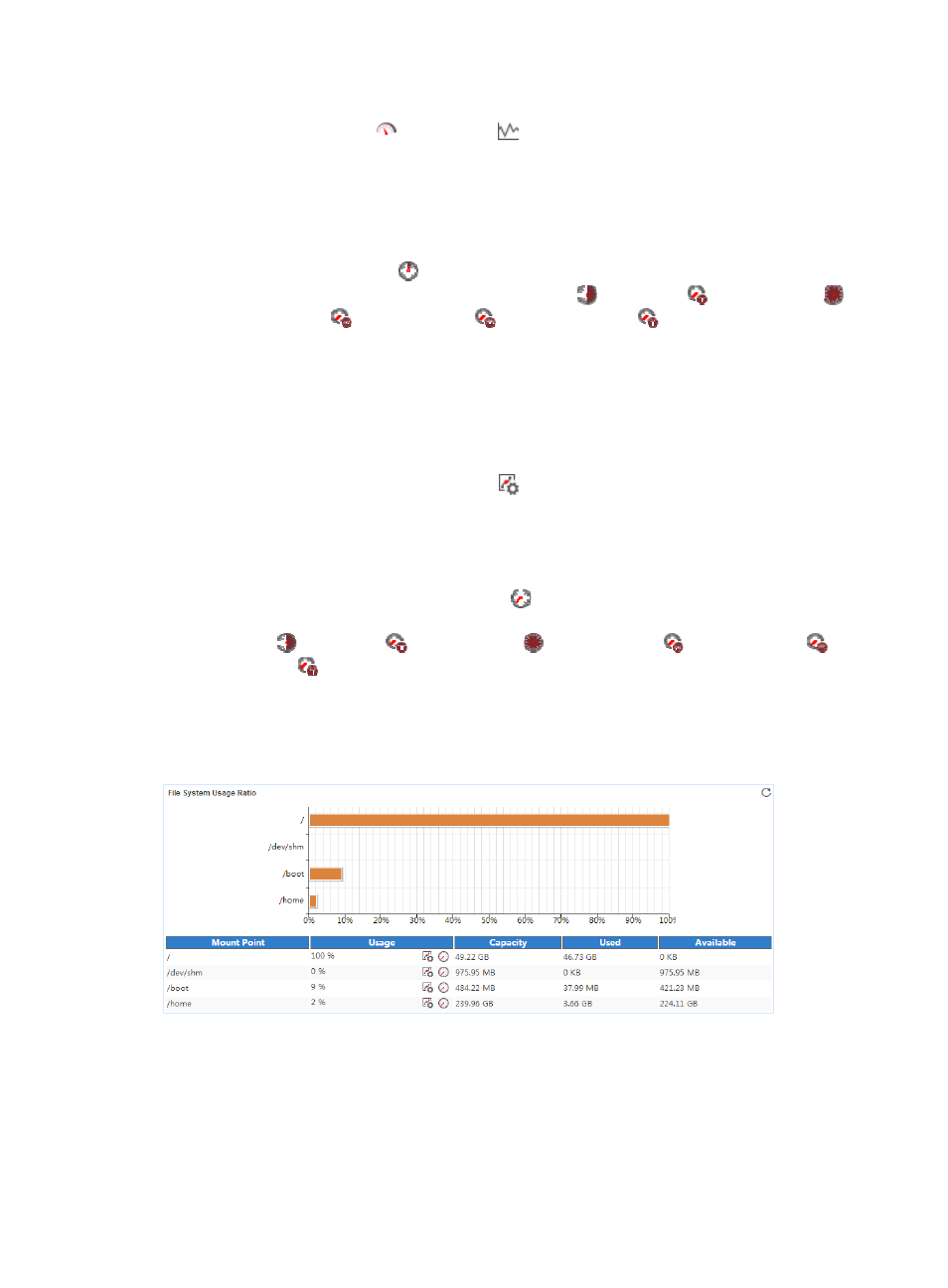
File System Usage Ratio
The File System Usage Ratio area layout is shown in
.
Figure 580 File System Usage Ratio area layout
File System Usage Ratio area fields:
•
File System Usage Ratio horizontal bar chart—Shows the space usage ratio of each mount point in
the last APM polling period. Point to a spot in a bar to view the space usage ratio of the specified
mount point.
•
Mount Point—Mount point of the file system in the operating system directory structure.
•
Usage—Space usage ratio of the file system.